SEPTEMBER 2025
Inkling — End-to-End E-commerce Platform
Designing a temporary tattoo shopping experience that's bold, effortless, and personal — from first click to checkout.
ROLE
UX Designer, Researcher, Moderator
INSTITUTION
University of San Diego
METHODS
Task testing · Likert scale · Think-aloud
BACKGROUND
Self-expression without commitment
Inkling is a concept e-commerce website for temporary tattoos, aimed at young adults aged 18–35 who love self-expression but don't want the permanence of real ink. The challenge: design a shopping experience that feels as bold and playful as the products themselves — while remaining clean, intuitive, and trustworthy enough to convert browsers into buyers.
PROBLEM
What needed solving
Temporary tattoo sites often fall into one of two traps: they feel cheap and generic, or they're cluttered and hard to navigate. Inkbox — the main competitor — produces beautiful imagery but struggles with content-heavy pages and unclear application instructions. Inkling needed to carve out its own space: approachable and fun, yet confident and credible.
“It’s not just about looking cool — it’s about telling a story, marking a moment, and wearing your personality proudly, even if just for a little while.”
PROCESS
How the project unfolded
-
Defined brand goals, target audience (18–35, self-expression focused), and benchmarked against Inkbox to identify design gaps and opportunities.
-
Created a full visual identity — logo variants, an 8-color palette blending tattoo depth with softness, and a dual-font typographic system (Marcellus + Inter).
-
Moved from low-fi layouts through high-fidelity screens covering home, category browsing, product detail, cart, checkout, and order confirmation.
-
6 participants aged 23–35 completed real tasks on the Figma prototype, followed by a Google Form questionnaire comparing Inkling with Inkbox.
-
Applied 3 targeted improvements based on test findings, grounded in Nielsen Norman Group heuristics and Baymard Institute research.
RESEARCH
Who was tested
Participants spanned healthcare, insurance, social services, software, and security — all frequent online shoppers with varied experience using temporary tattoos. Sessions included think-aloud task observation followed by a structured questionnaire.
6
PARTICIPANTSP
23 - 35
AGE RANGE
15 - 20
MINUTES PER SESSION
100%
MOBILE - FIRST BROWSERS
FINDINGS
What users said
CATEGORY NAVIGATION
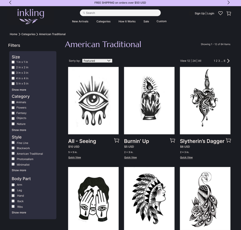
Most found the "American" category easily, but the section header "What's In" confused several users who didn't recognize it as a navigation area.
FILTERS FELT COMPLEX
Numeric sizing (e.g. "2in × 3in") was hard to parse. Users wanted natural labels like S / M / L and found the sidebar placement overwhelming..
CHECKOUT WAS SMOOTH
Adding to cart felt straightforward. A few users expected a slide-out cart drawer rather than a full page. Apple Pay / Shop Pay integration was a recurring ask.
STRONG FIRST IMPRESSION
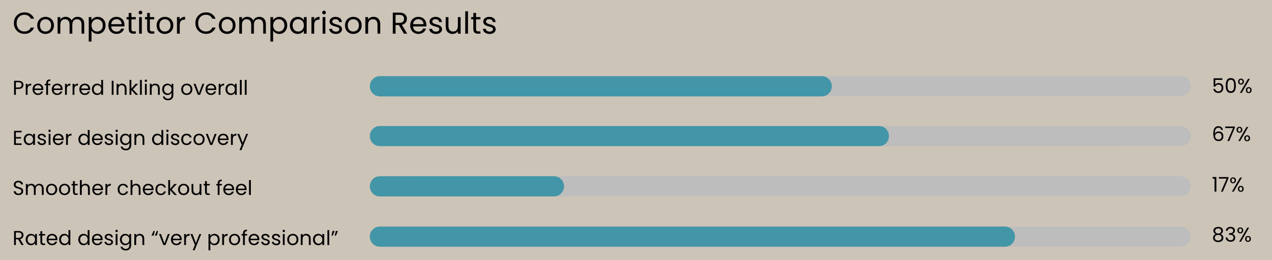
Described as "clean," "balanced," and "cute." 83% rated the design "very professional." Users said they'd purchase based on branding alone.
50%
Preferred Inkling overall
67%
Easier design discovery
17%
Smoother checkout feel
83%
Rated design “very professional”
ITERATIONS
Three changes, clear rationale
01
Category Visability
Renamed the section and enlarged the category cards into a navigable carousel with explicit arrows — applying NN/g's "match between system and the real world" heuristic.
BEFORE
Labeled "What's In" — small images, unclear as navigation, easy to scroll past.
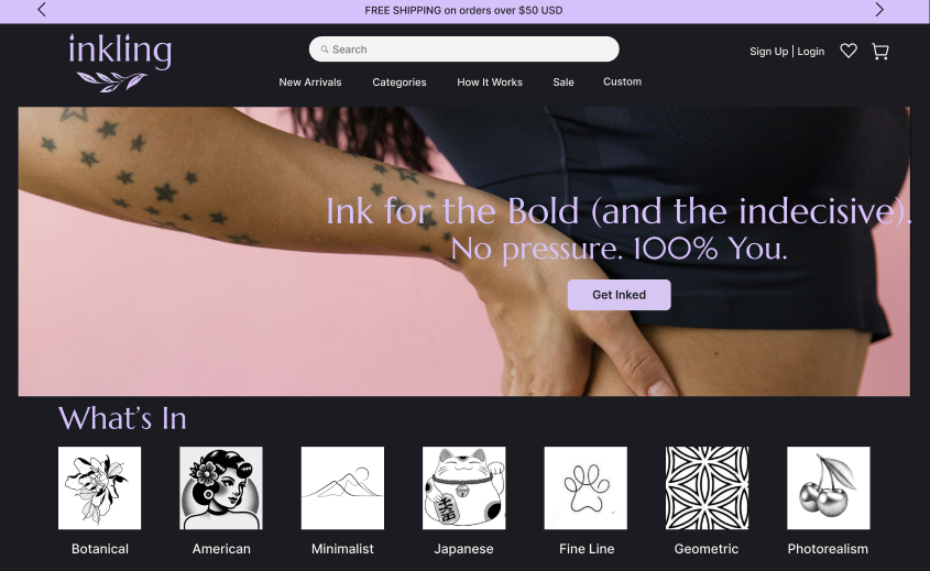
Small Category Images
AFTER
Labeled "Categories" — larger cards in a carousel with arrows, immediately recognizable as browseable navigation.
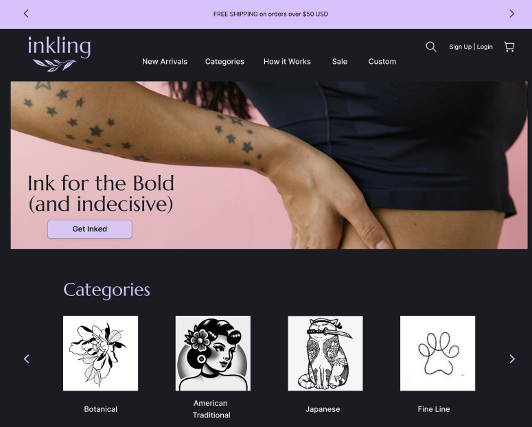
Larger Category Carousel
02
Filter Placement & Labels
Moved filters from a dense left sidebar to a horizontal dropdown bar. Replaced exact dimensions with S / M / L labels. Per Baymard Institute: horizontal filtering works well when the filter count is limited.
BEFORE
Left-hand sidebar with technical sizing (2in × 3in) — visually heavy, hard to interpret quickly.
Extensive Sidebar Filter
AFTER
Top dropdown bar with S/M/L chips — one filter visible at a time, more breathing room for the product grid.
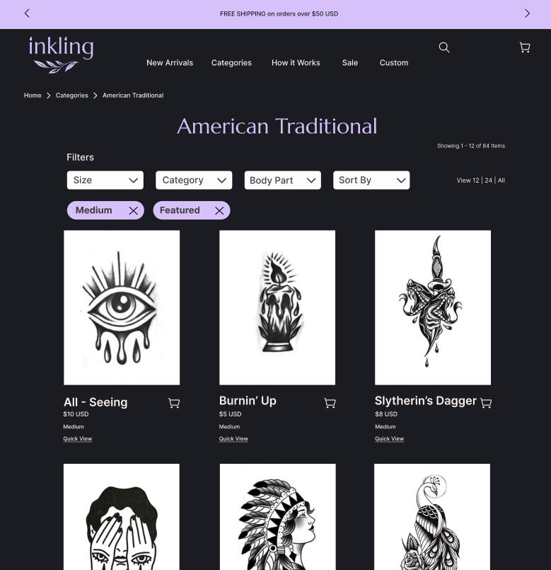
Dropdown Filter
03
Hover State for Product Previews
Added a lifestyle image hover state on each product card, toggling between the clean B&W design and an on-skin photo. Backed by UX matters research on how high-quality imagery drives trust and conversion.
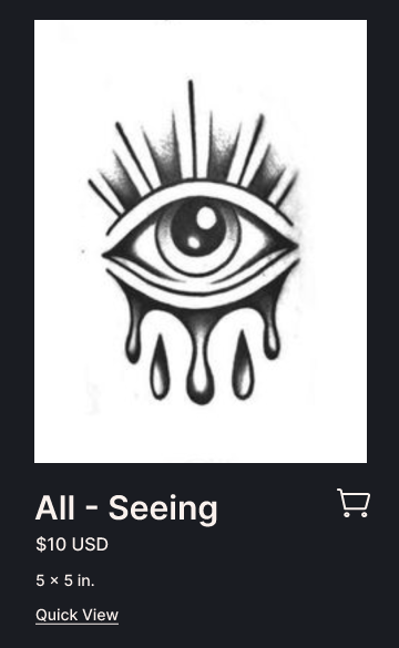
BEFORE
All previews in black and white only — clean but lacking real-world context.
Black and White Product Image
AFTER
Hover reveals a lifestyle photo of the tattoo on skin — giving both precision and inspiration without cluttering the grid.
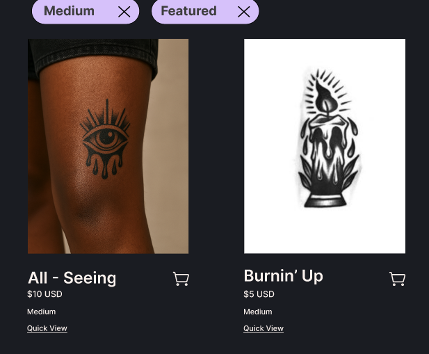
Hover State Comparison
REFLECTION
What was learned & what’s next
This project reinforced that creating an engaging experience means balancing personality with usability. While playful copy added character to the brand, users relied more heavily on clear labels and familiar interaction patterns when navigating the site. Introducing recognizable conventions, such as simplified sizing and trusted checkout options, reduced decision fatigue, and increased confidence throughout the shopping journey. Most importantly, think-aloud testing revealed moments of hesitation and friction that post-test surveys alone would not have captured.
Discover. Try. Express.
Through usability testing, we can see how users discover designs, choose with confidence, and shop with ease. Insights from real users helped shape a more intuitive, trustworthy, and expressive shopping experience.
USABILITY TESTING · USER INSIGHTS · E-COMMERCE · TASK ANALYSIS
HEURISTIC EVALUATION · DESIGN IMPROVEMENTS