MAY 2025
Redesigning the VA Health & Benefits Mobile App
A research-driven analysis of three critical usability failures affecting veterans' access to healthcare and benefits, and how user-centered design can fix them.
ROLE
UX Researcher & Designer
INSTITUTION
University of San Diego
METHODS
Heuristic Evaluation · User Testing
BACKGROUND
A tool veterans depend on — but struggle to use
The VA Health and Benefits mobile app gives U.S. veterans access to appointments, claims, secure messaging, and digital ID. It's a critical lifeline. However, significant usability issues persist, particularly for older veterans, users with disabilities, and those with limited digital experience.
This case study identifies and addresses three core problems that undermine the app's reliability: unclear appointment details, missing in-app support, and a friction-heavy login process.
-

Veterans tested, ages 30s–60s with varied tech comfort
-

Critical usability issues identified across key flows
-

Nielsen heuristics applied in structured evaluation
PARTICIPANTS
Who this is designed for
Older Veteran
Limited mobile app experience; relies on the app for healthcare management

Mid-Career Veteran
Moderate tech proficiency; balances work and VA care needs

Caregiver
Manages a veteran’s healthcare on their behalf

Younger Veteran
Mobile-first; primarily manages health through apps

APPROACH
Mixed-methods research
Heuristic Evaluation

Applied Jakob Nielsen's 10 usability heuristics to identify systemic design violations across the app's key flows.
Task-Based Walkthroughs

Simulated real tasks — scheduling appointments, secure messaging, checking eligibility — to surface pain points in context.
User Interviews

Informal conversations with five veterans validated evaluation findings with lived experience and personal frustrations.
PROBLEM IDENTIFICATION
Three issues, real consequences
01
Ineffective Appointment Details
The appointment details present information in a dense, poorly-organized format. Key details appear at the top of the screen. However, it is not easily scannable, and some users find it difficult to quickly identify details such as type, with whom, and where.
“Honestly, the preview of the appointment isn’t the problem, it’s when I need to get a little more information.”
KEY INSIGHTS
3 of 5 participants complained that the page was difficult to quickly identify key information
2 participants were confused about which elements were tappable vs. informational
All participants wished they had a button that could easily get them connected to their video appointment or directions to the facility
CURRENT PROBLEM
The current appointment interface lacks clear information hierarchy and glanceable visual indicators, making it difficult for users to quickly interpret essential appointment details. Missing provider information, limited visual differentiation, and hidden location details may create confusion, especially for users managing multiple appointments or accessing care under stress.
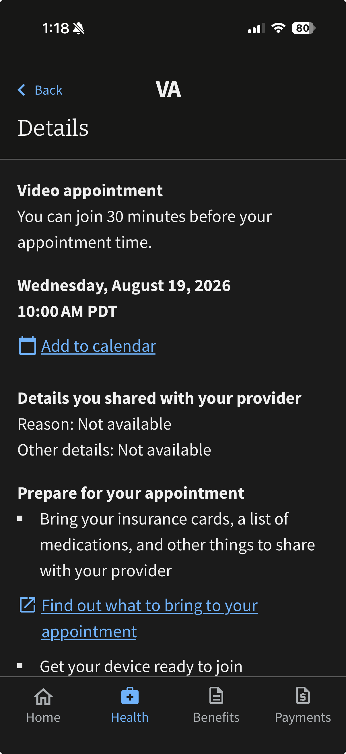
Appointment Details
PROPOSED SOLUTION
Redesigned cards with sectioned detail blocks: large appointment-type icon (video vs. in-person), provider name and department prominently labeled, one-tap actions (Join Visit / Get Directions) immediately visible.
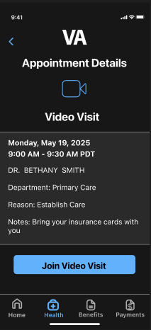
Redesigned Appointment Details
02
Lack of In-App Support
The app provides no embedded help, FAQ, or chat — only an external phone number. When users get confused or encounter errors, there's nothing to turn to inside the app itself. 80% of participants said they had to exit the app entirely to get answers.
“Honestly, the preview of the appointment isn’t the problem, it’s when I need to get a little more information.”
KEY INSIGHTS
All participants searched the app for a help button and couldn’t find one
4 out of 5 participants said they typically call the VA or use the website for answers
Participants expressed their desire for an in-app feature to answer their questions
CURRENT PROBLEM
The only "help" is a Contact VA page listing a phone number. There is no search, no FAQ, no in-context guidance, and no way to resolve common errors without abandoning the app entirely.
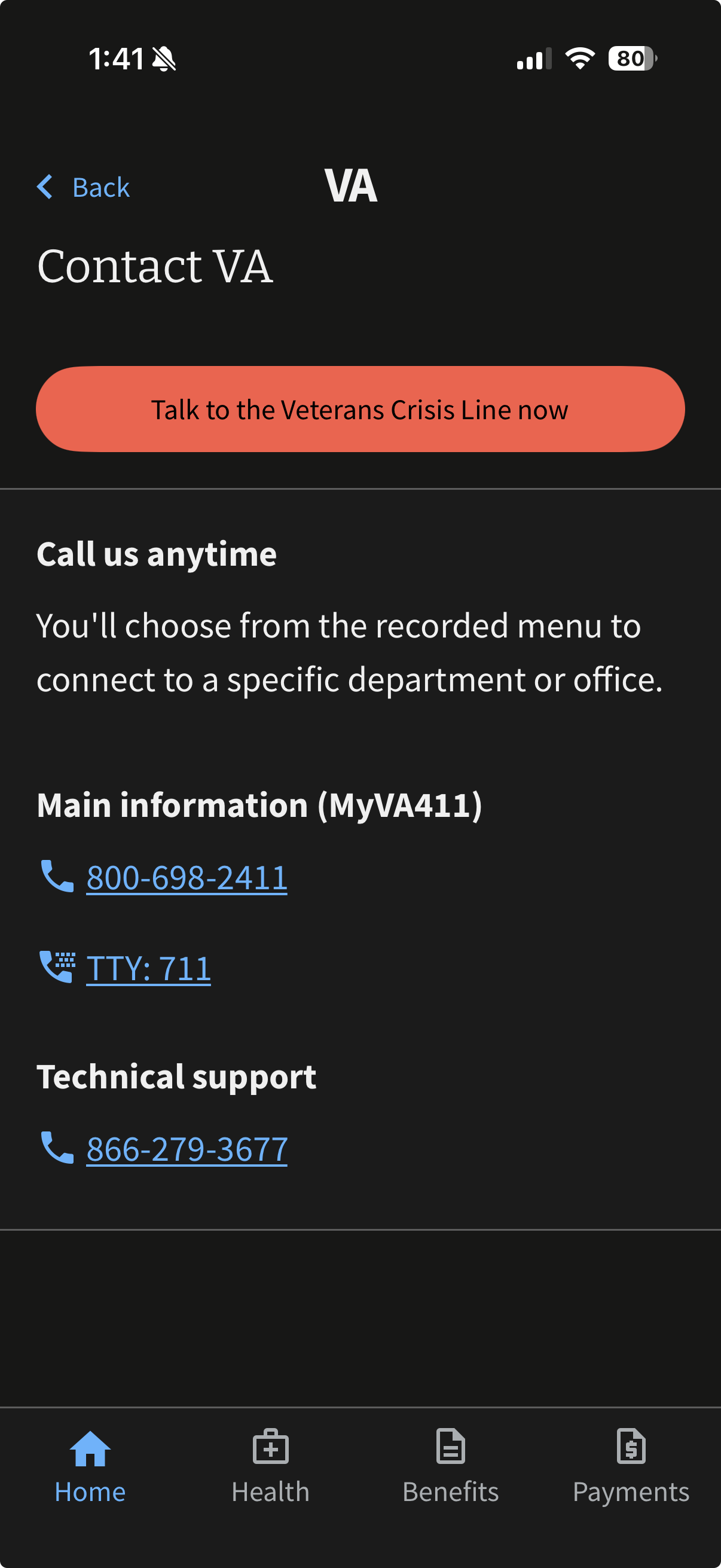
Support Page
PROPOSED SOLUTION
An embedded FAQ & Support center with a search bar, categorized common topics, expandable answers, and a "Start a Live Chat Now" option — all accessible without leaving the app.
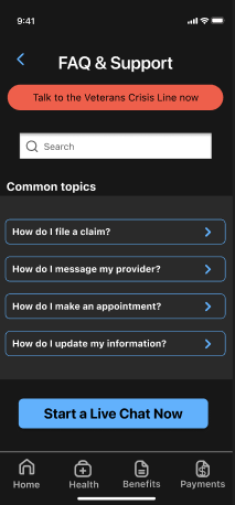
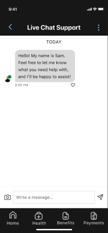
Redesigned FAQ and Live Chat
03
Friction-Heavy Login Process
Despite Face ID being available, users are still routed through multiple redirect screens, MFA code requests, and waiting states when Face ID fails. For veterans managing anxiety, PTSD, or cognitive fatigue, this friction can become a serious barrier to daily use.
“Even with Face ID, it feels like I have to jump through hoops to get in.”
KEY INSIGHTS
4 of 5 participants described login as slow, repetitive, or discouraging when Face ID was not available
Participants reported abandoning urgent health checks due to login delays
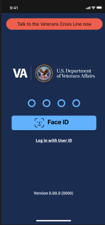
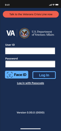
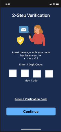
CURRENT PROBLEM
Login routes through external identity providers (Login.gov, ID.me, DS Logon), each with its own MFA flows. Biometric login exists, but doesn't eliminate redirect screens or code entry — adding steps instead of removing them.
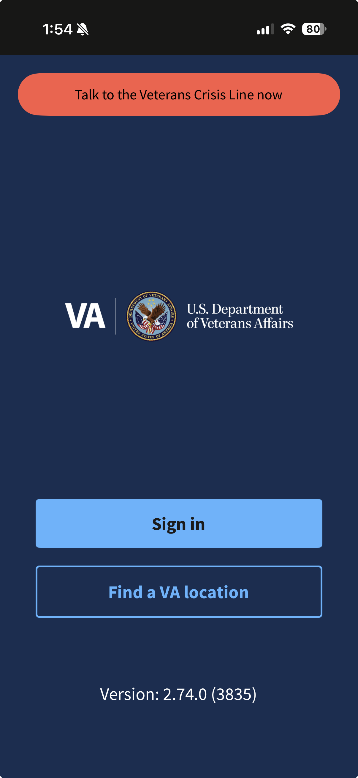
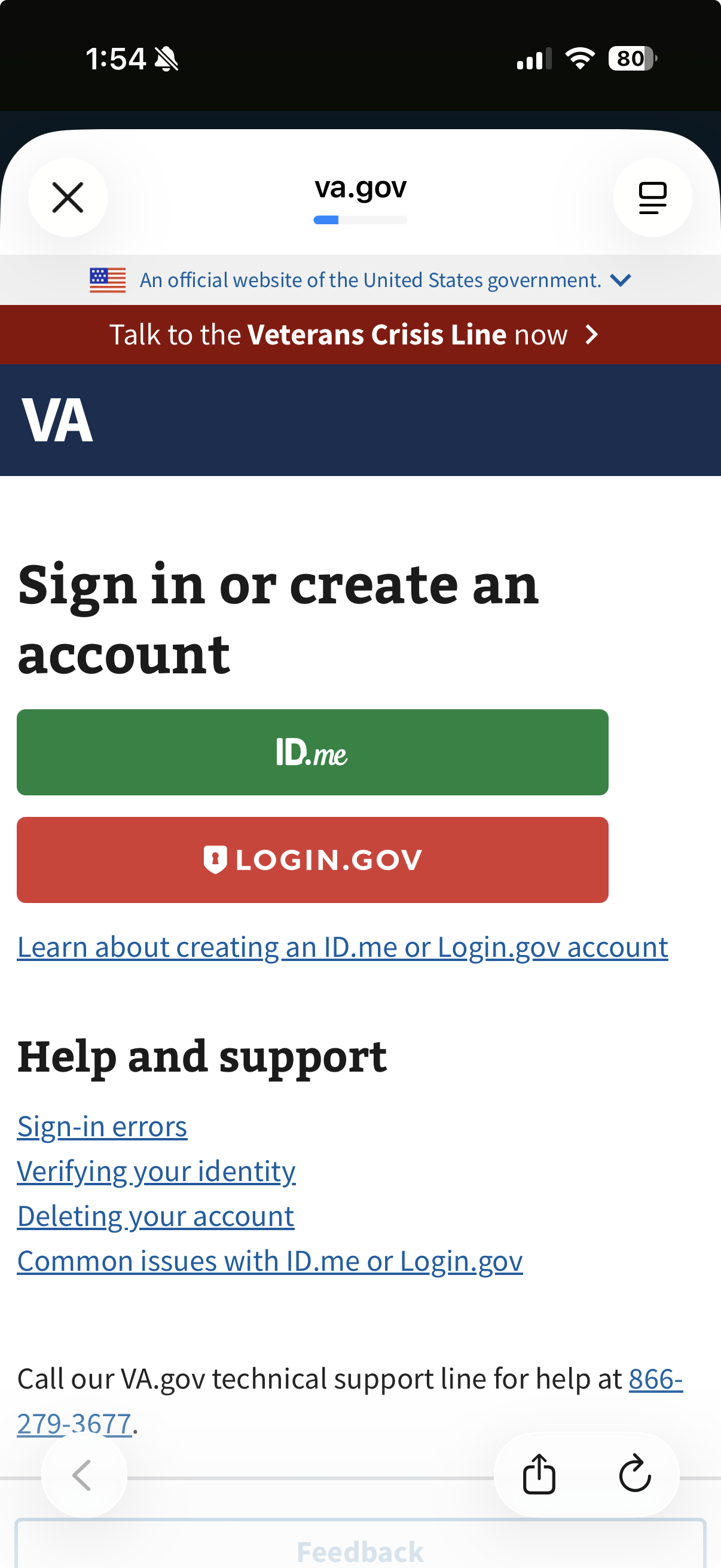
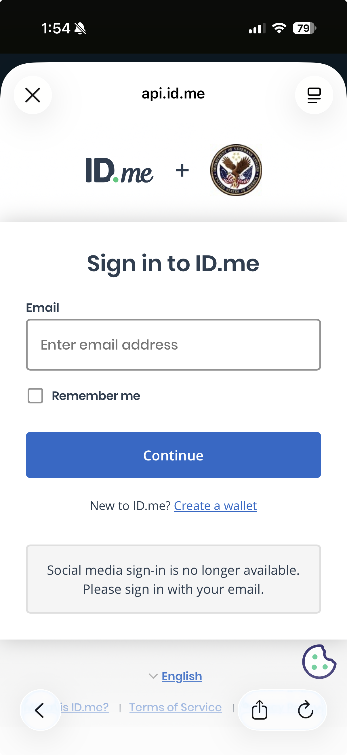
Login Flow Without Face ID
PROPOSED SOLUTION
Streamlined three-path login: biometric, PIN, or username/password with MFA option. Fewer screens, faster access.
Redesigned Login Options
OUTCOME
Design that works for those who served
Each proposed redesign directly addresses a documented failure point — confirmed by user feedback, validated by heuristic analysis, and grounded in the specific needs of a veteran user base. The changes prioritize clarity over density, confidence over confusion, and speed over bureaucratic friction.
The ultimate goal is an app veterans can open in a moment of need and immediately find what they're looking for — without a phone call, without a Google search, and without frustration.
Clarity. Support. Access.
By tackling appointment legibility, embedded support, and login simplicity, we can meaningfully improve trust, task completion, and daily engagement for the veterans this app was built to serve.
APPOINTMENT UX · IN-APP SUPPORT · AUTHENTICATION · ACCESSIBILITY
HEURISTIC EVALUATION · USER RESEARCH